Wall Colors
These are a series of site-specific paintings in the corridors of the Yale painting studio.
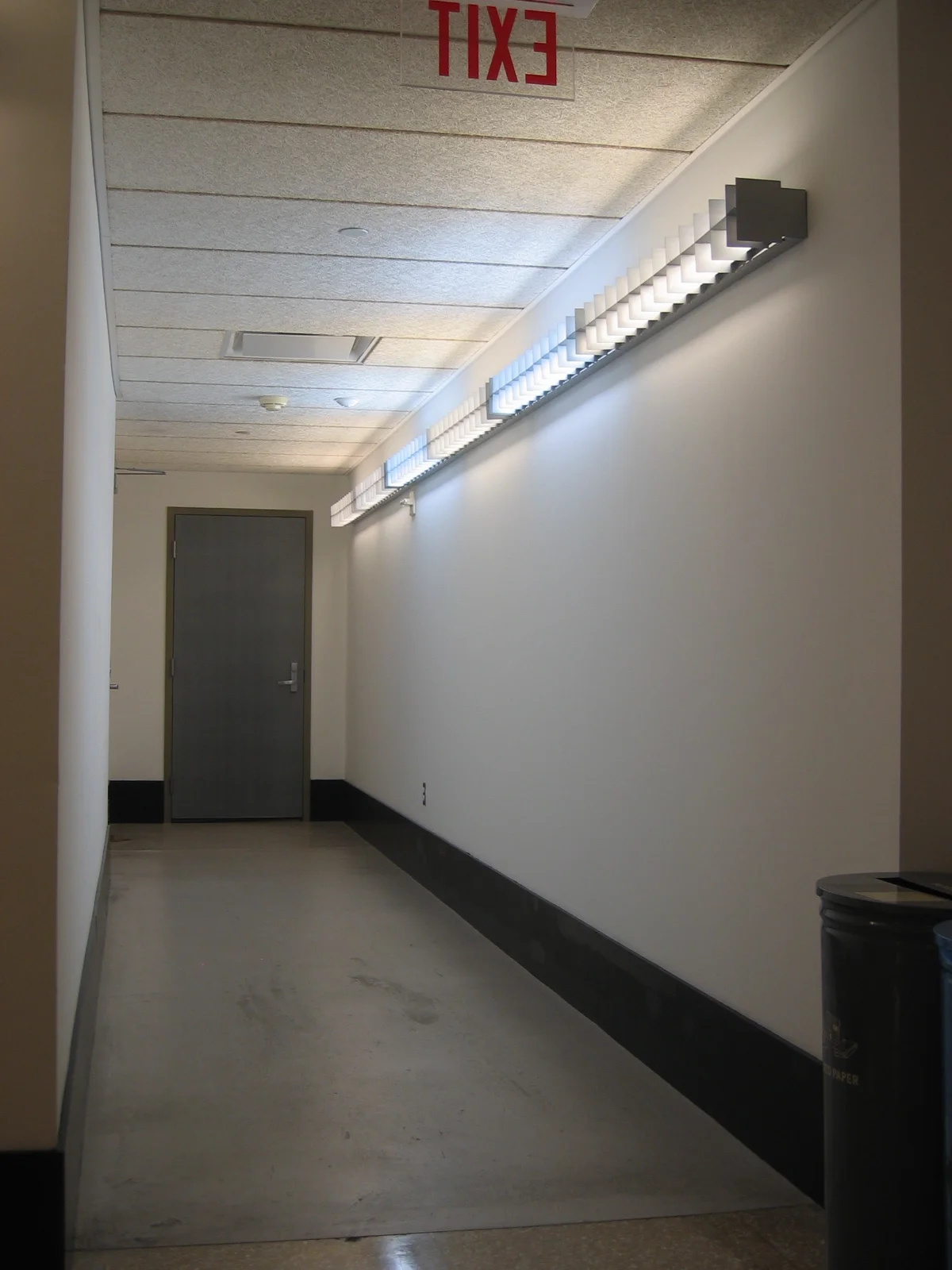
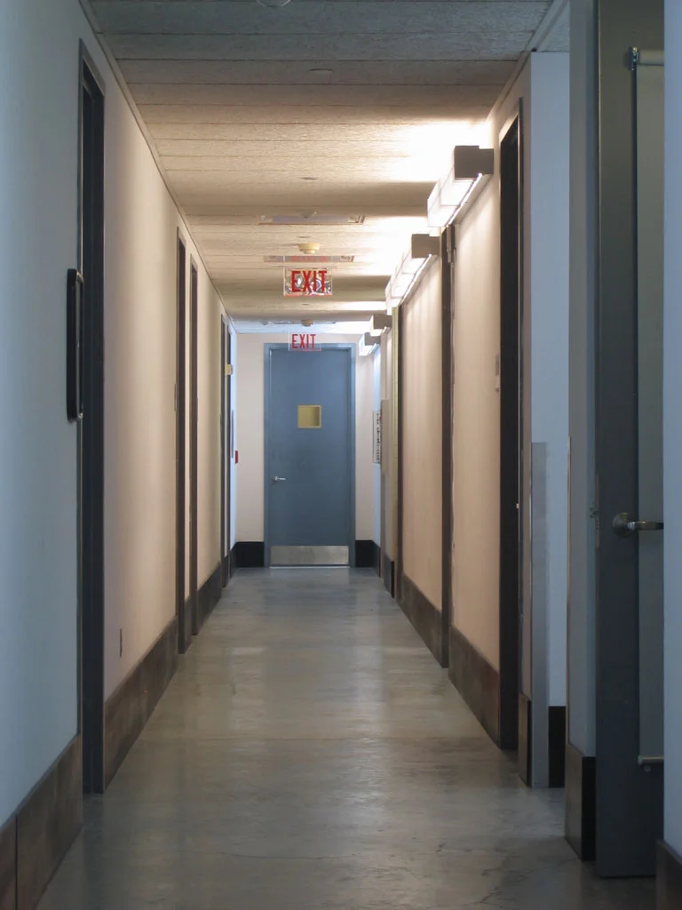
Yale’s graduate painting building is a clean, white, fluorescent-lit structure that starkly contrasts the usual paint-encrusted studio environment. When we first arrived, many in my group of first-year graduate students seemed to regard it as colorless and sterile. Disrupting this official regularity, however, the light fixtures contained bulbs of various mismatched color temperatures that illuminated the walls from different directions in various kinds of warm and cool light. Thus the ostensibly bland building was actually a quite colorful place, though everyone seemed to disregard it.
Continuing a line of experimentation with light and surface colors I began in Cheshire, I began to paint segments of the corridor walls. I carefully mixed flat interior latex colors to match the appearance of one of the nearby “white” walls as it appeared in the light of the space. I’d choose, for example, an external corner where two hallways intersected and paint one side of the corner to match the apparent color of the other. These paintings are difficult to convey in photographs, unfortunately, since they played upon an immersed experience of the shifting colors of ambient light as one moved through the building. In situ, however, the paintings were easy to grasp, though not always easy to spot. Camouflaged as they were, they typically went unnoticed at first until someone happened to notice, say, a seam above a doorway where the colored paint ended and the truly white paint continued. From there, word of mouth helped spread awareness of the existence of these pieces throughout the building.
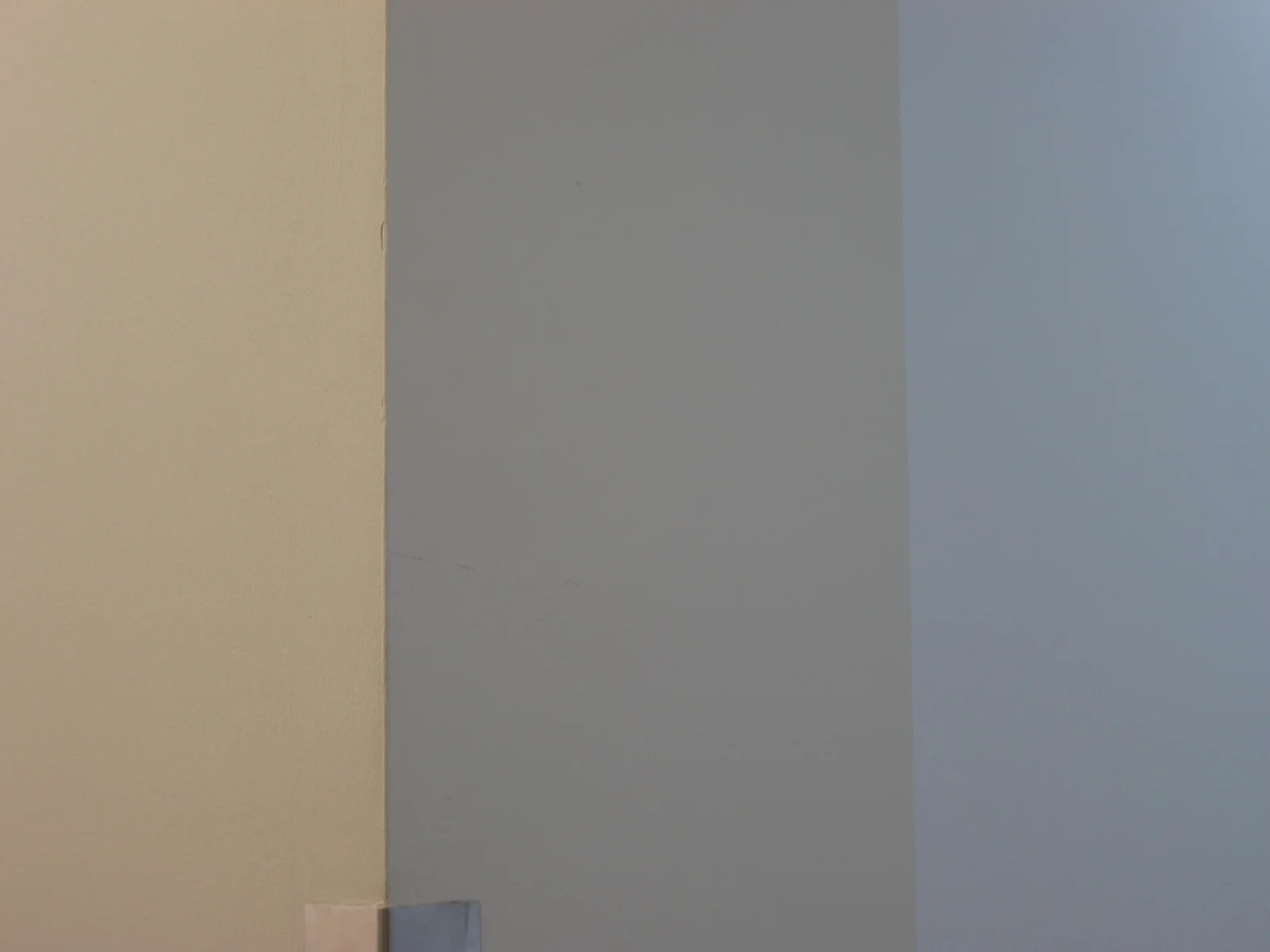
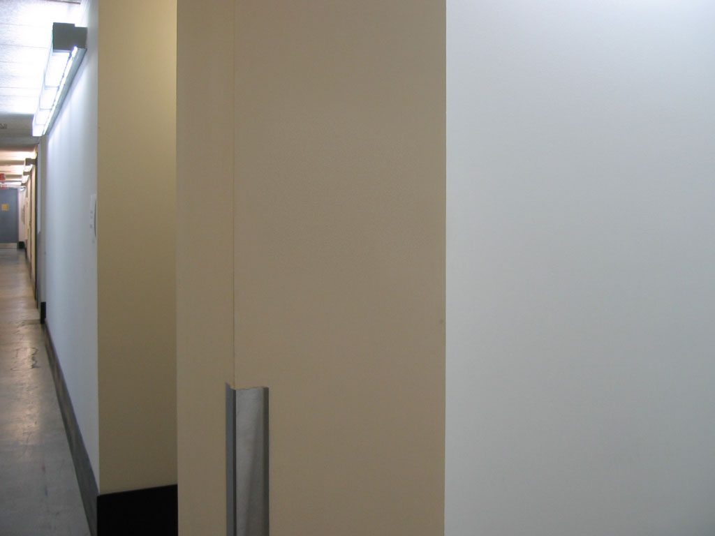
Blue Corner. The main hallway appears in cool fluorescent light while the hallway branching to the right is lit with warmer fluorescents. The visible wall of the branching hallway is painted blue to match the color of the main hallway.
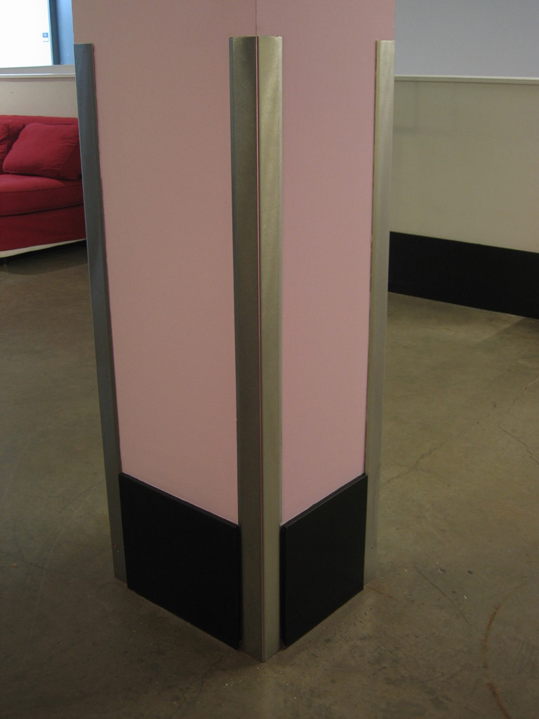
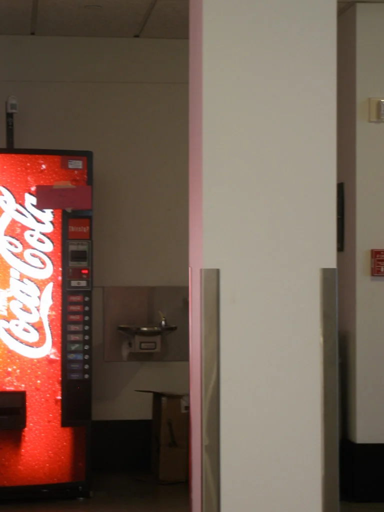
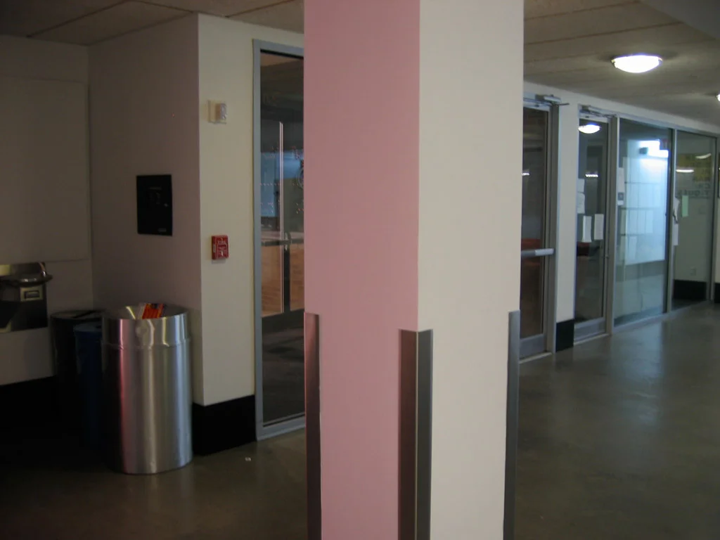
Pink Column. One side of a column appears pink in the red glow from a nearby vending machine; a second side is painted to match this color.
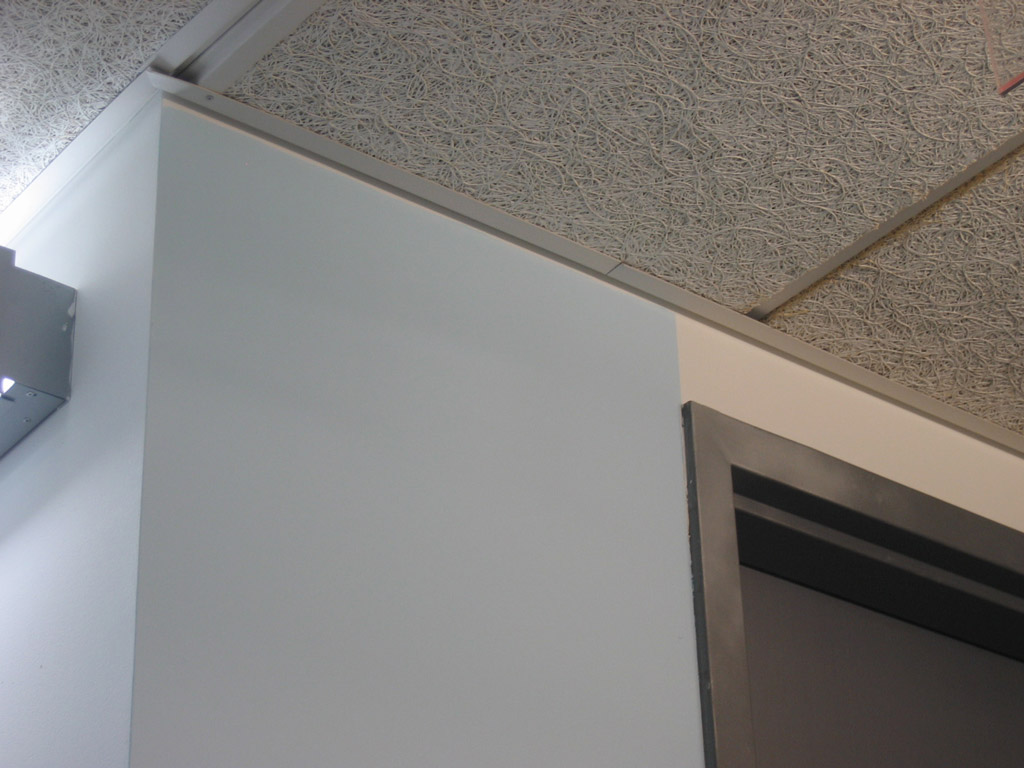
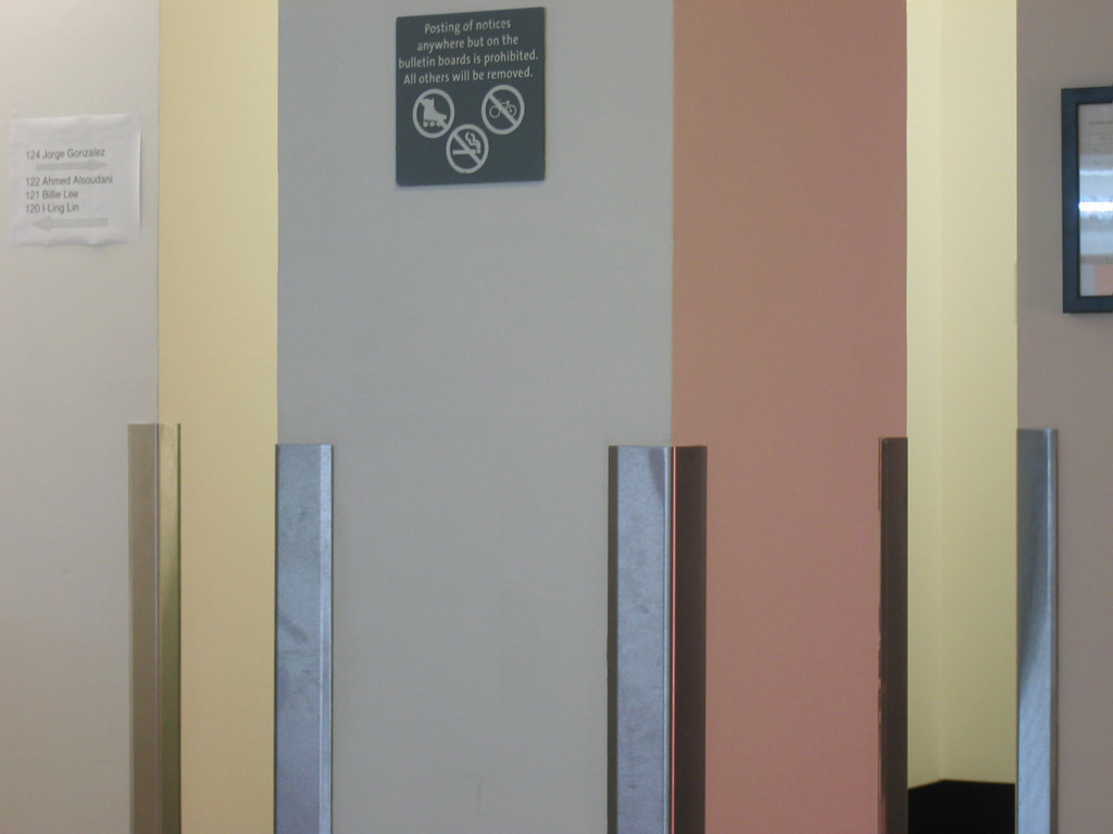
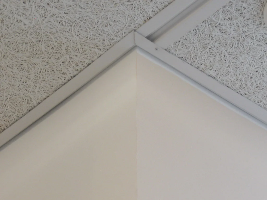
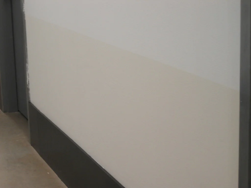
Beige corner. The front face of this column is painted beige to match the adjacent left face, which remains white but appears in dimmer, warmer light. The beige paint can be seen near the ceiling, where a little of the original white remains visible.
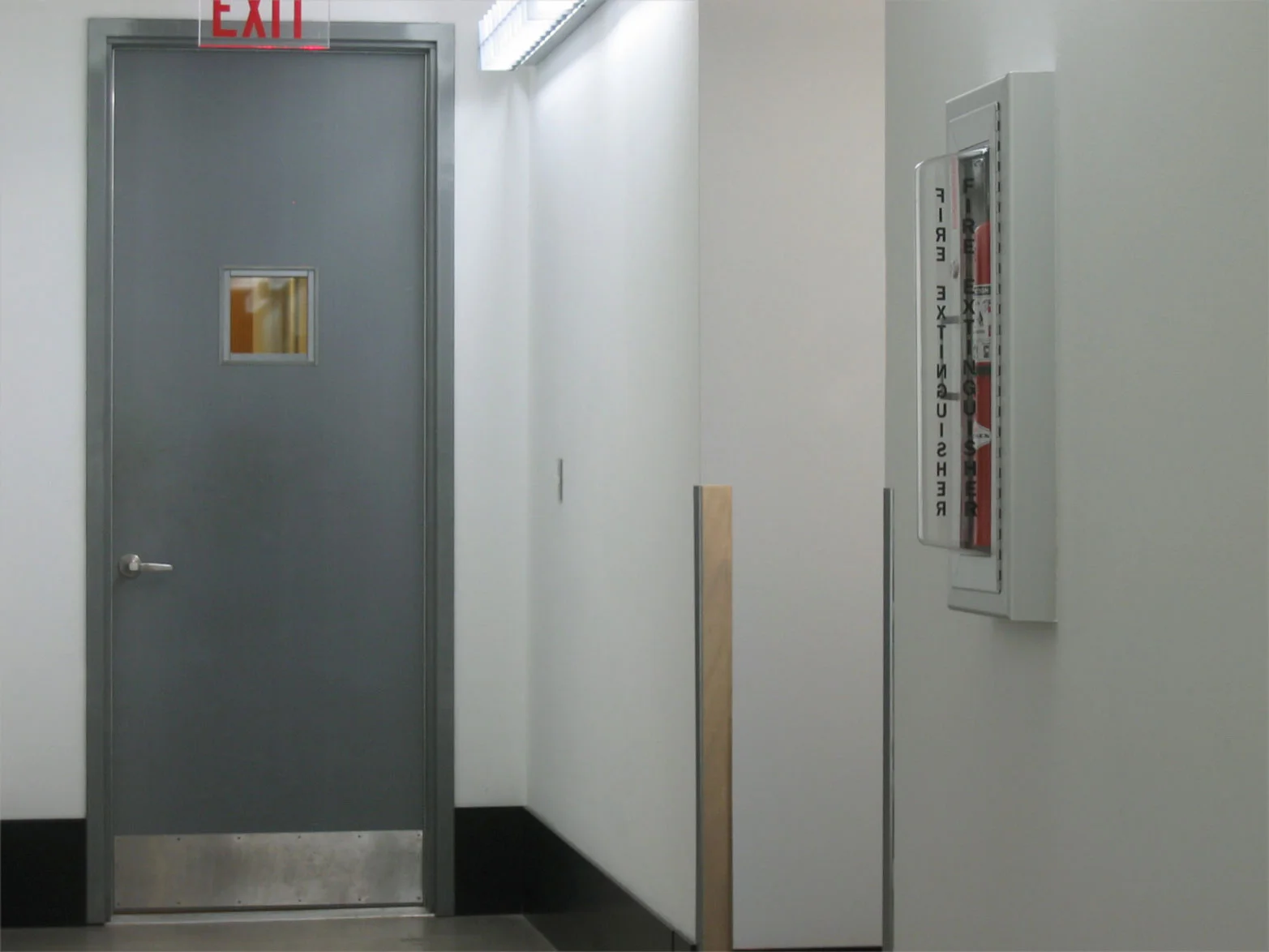
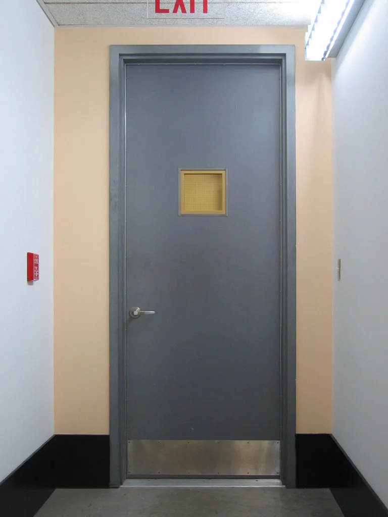
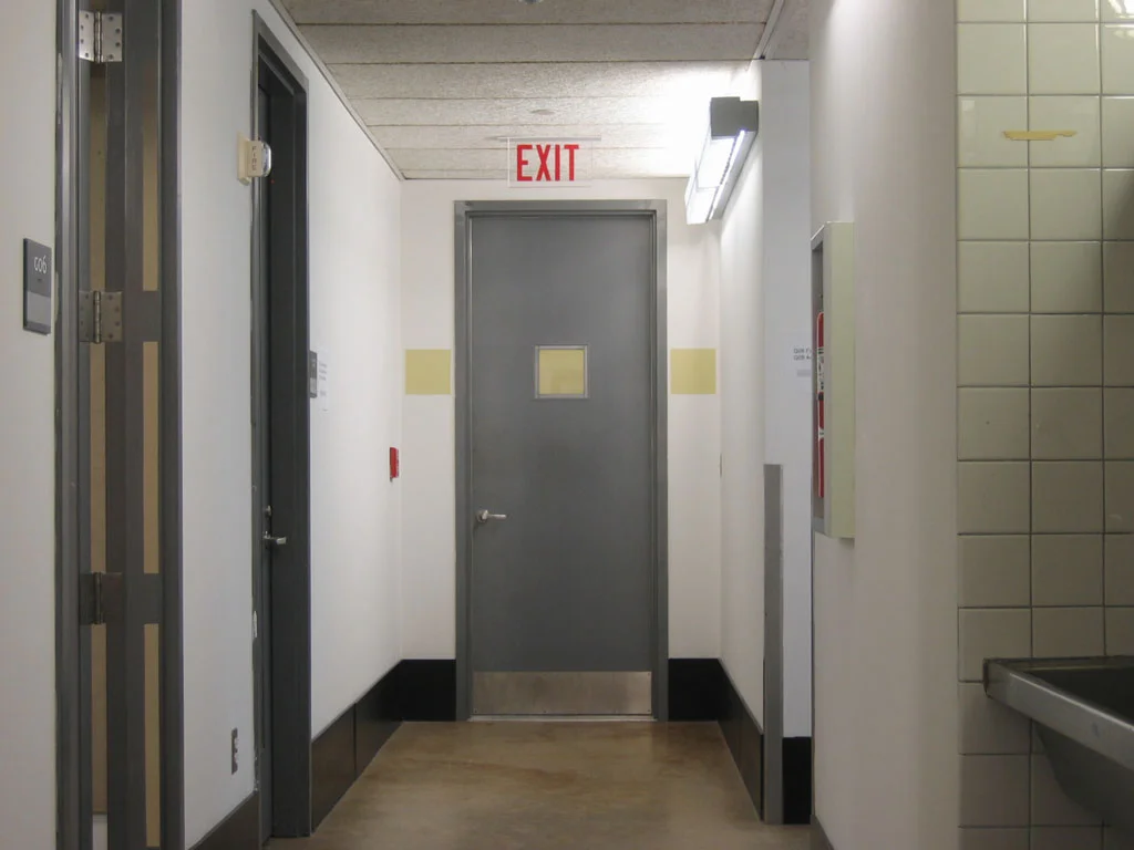
Warm Doorway. The end wall of a hallway is painted orange to match the dominant warm color of the hallway. The effect is imperceptible from the far end of the hall but unmistakable up close. The rim of the door window has also been painted yellow to match the warmly-lit white wall beyond.
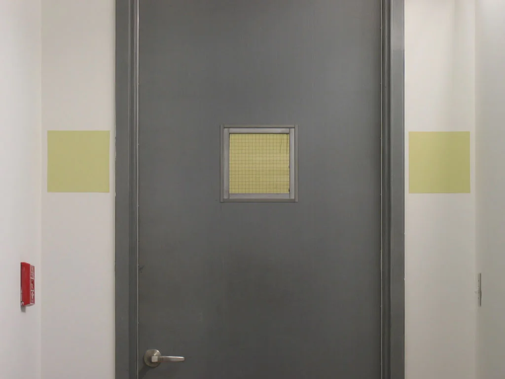
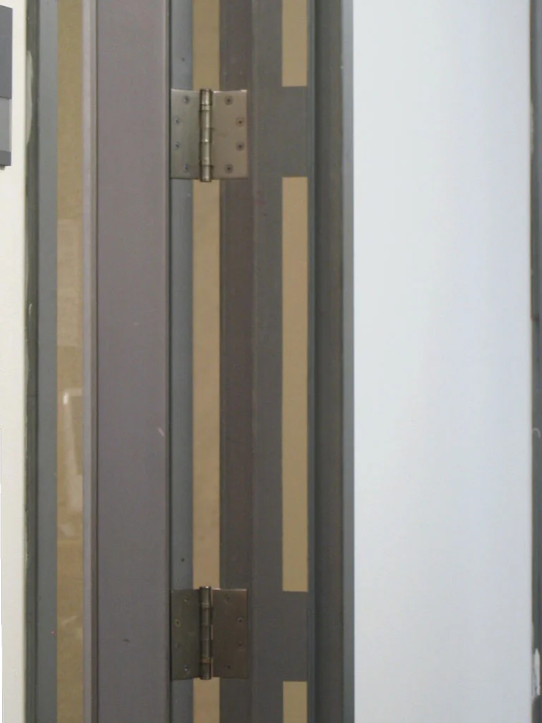
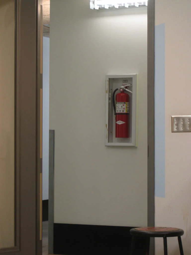
Basement Cluster. A collection of paintings in close proximity. I repeated the green square appearance of a white wall through a door window on either side of the door itself. Nearby, the gap between a door and its doorframe is copied onto the doorframe itself. I applied the cool green appearance of the tiles in the sink alcove to the side of a fire extinguisher box. A blue trapezoid echoes the visible portion of a distant wall.
Beyond the initial simple delight in the illusion of these paintings, an interesting phenomenon emerged among the other graduate students. Since the treated parts of the wall appeared so similar to the untreated parts, the students began to watch keenly for the subtle cues that revealed a new artwork. Like weather, this shared experience of the environment became a topic of conversation and a common point of reference for the community of painters. They became attuned to the shifting planes of color within the seemingly colorless building, so that some began to see artworks where I had created none. For example, one of my colleagues complimented me on a delicate beige monochrome that turned out to be not a painting, but a shadow she had never before noticed despite passing it daily. She had incorrectly perceived it as my creation, but since precisely that type of sensitivity to omnipresent color phenomena inspired the whole game in the first place, I found her aesthetic appreciation of the shadow entirely appropriate.
How do we distinguish what we are supposed to see from what we see? If the beige monochrome is a Duchampian readymade, who is its author—my colleague or me? And does it make a difference? I became unsure whether the color paintings were individual artworks, or a single assisted readymade. Sir Arthur Conan Doyle drew a distinction between seeing and observing, and created an imaginary person who could observe everything. Perhaps we are not capable of such a feat. But how do we decide which of our perceptions are significant and which are to be ignored?
